When I am doing development on ROBOTC, I find I am switching back and forth a lot between Visual Studio 2013 and the ROBOTC IDE. Personally, I prefer the font that VS2013 uses by default, which is Consolas. It’s friendly to the eyes and looks crisp. ROBOTC, on the other hand, will use Courier New as its default, which I find less refined looking.
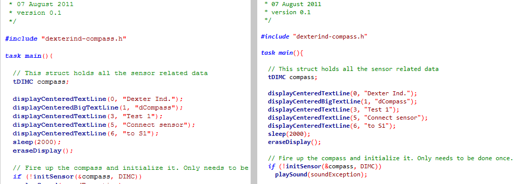
Here’s a side-by-side comparison of the two. Click on the image for a larger version.
The one on the left is using Courier New, the one on the right is using Consolas.
Another comparison below. Again, Courier New on the left, Consolas on the right.

I’ve used this font for some time now and I’ve found that it makes switching back and forth between Visual Studio and ROBOTC easier.
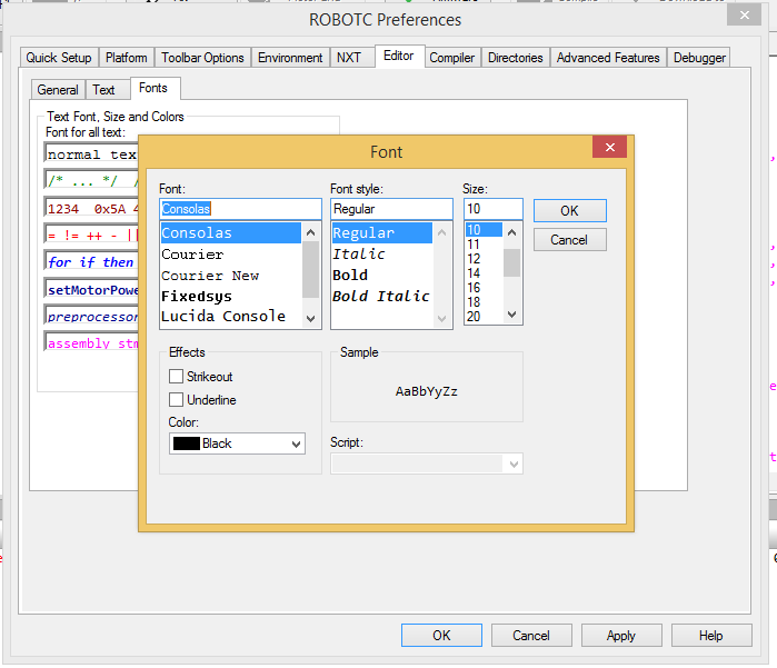
Changing your fonts in ROBOTC is quite painless. First, set the menu level to “Expert”, this will give us access to the preferences setting we’ll need to configure the editor.

Next, open the Detailed Preferences by pressing Ctrl-Shift-Alt-D; try not to sprain anything while you do this. Navigate to the “Editor” tab and click on the “normal text”, which will bring up a font selector. Choose “Consolas” and click OK and OK again to close the Preferences pane.
You’re now good to go! That was pretty easy, wasn’t it? It looks like Windows 8 and Windows 10 both have Consolas as one of their built-in fonts. I have not tested this on Windows 7, but if you’re missing this font, for some reason, you can download them from here: [LINK]. Just make sure you get all four flavours of it. You can install them by right clicking on the downloaded .ttf files and selecting “Install”.
Please note that font preferences are about as personal as your favourite Linux distribution, political affiliation and religion, so your mileage may vary, etc. Perhaps you’d like to leave a comment with your own favourite font?
 Bot Bench I'd Rather Be Building Robots
